Solar panel analysis pt 1: Exploration
Intro
I have a nice solar panel data set that I’ve been playing around with quite a bit. When active the panels send power and temperature data every 10 minutes and they have been doing so since November 2015. The goal of this post is to get some feeling of the patterns in this dataset. I’ll be using tools from the R tidyverse to do so.
Let’s start by loading the data and looking at the last 6 rows.
library(rprojroot)
library(lubridate)
rt <- rprojroot::is_rstudio_project

solar_df <- read_csv2(rt$find_file("static/files/solar_power.csv"))%>%
  # the times in the raw dataset have CET/CEST timezones
  # by default they will be read as UTC
  # we undo this by forcing the correct timezone
  # (without changing the times)
  mutate(timestamp = force_tz(timestamp, tzone = 'CET'))%>%
  # Since we don't want summer vs winter hour differences
  # we now transform to UTC and add one hour.
  # This puts all hours in CET winter time
  mutate(timestamp = with_tz(timestamp, tzone = 'UTC') + 3600)

kable(tail(solar_df), align = 'c', format = 'html')| timestamp | temperature | power |
|---|---|---|
| 2017-10-31 16:40:00 | 23.2 | 31 |
| 2017-10-31 16:50:00 | 23.0 | 26 |
| 2017-10-31 17:00:00 | 22.8 | 15 |
| 2017-10-31 17:10:00 | 22.4 | 6 |
| 2017-10-31 17:20:00 | 22.1 | 2 |
| 2017-10-31 17:30:00 | 21.8 | 0 |
Power and temperature over time
Let’s see how power changes over time.
# create a blue to red colour palette to display temperature.
# I dont want the white colour located at index 5
# in the RdBu palette so I deselect it
library(RColorBrewer)
temperature_palette <- rev(brewer.pal(9, "RdBu")[c(1:4, 6:9)])
solar_df%>%
ggplot(aes(x = timestamp, y = power, colour = temperature))+
geom_point(alpha = 0.6, size = rel(0.8)) +
scale_x_datetime(date_breaks = "3 months",
date_labels = "%b\n%Y", expand = c(0, 0))+
scale_y_continuous(expand = c(0, 0))+
labs(y = "Power (W)")+
scale_colour_gradientn(colors = temperature_palette,
name = 'Temperature (°C)',
breaks = c(15, 25, 35, 45)) +
theme_minimal()+
theme(text = element_text(colour = "grey40"),
legend.position = 'top',
legend.justification = 'left',
axis.title.x = element_blank())+
guides(colour = guide_legend(title.position = "top",
override.aes = list(size = rel(3))))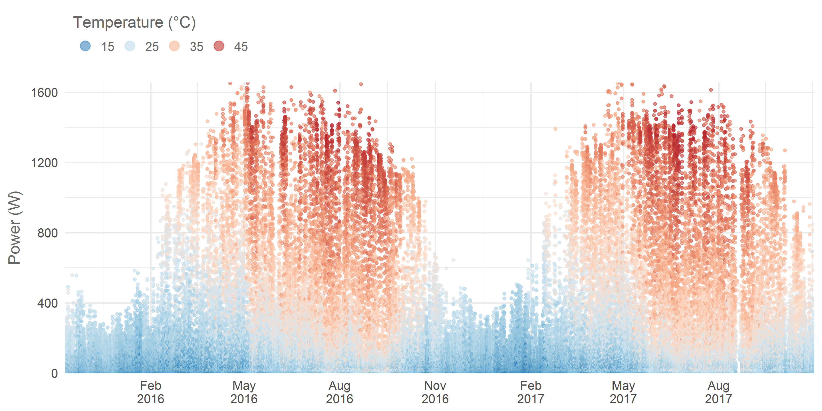 Each dot represents the power measured over a 10 minute interval. The differences between summer and winter are quite striking. My hometown Antwerp has a latitude of 51.2° so seasonal differences are strong. From this cool website we learn that in the midst of winter the sun only rises to 15.4° above the horizon whereas in the hart of summer it goes up to 62.2°. Also notice how in summer the panel’s temperature can go up to 45°C!
Let’s have a closer look at this temperature variable by putting it on the y-axis.
solar_df%>%
ggplot(aes(x = timestamp, y = temperature, colour = power))+
geom_point(alpha = 0.6, size = rel(0.8)) +
scale_x_datetime(date_breaks = "3 months",
date_labels = "%b\n%Y", expand = c(0, 0))+
scale_y_continuous(expand = c(0, 0))+
labs(y = "Solar panel temperature (°C)")+
viridis::scale_colour_viridis(name = 'Power (W)') +
theme_minimal()+
theme(text = element_text(colour = "grey40"),
legend.position = 'top',
legend.justification = 'left',
axis.title.x = element_blank())+
guides(colour = guide_legend(title.position = "top",
override.aes = list(size = rel(3))))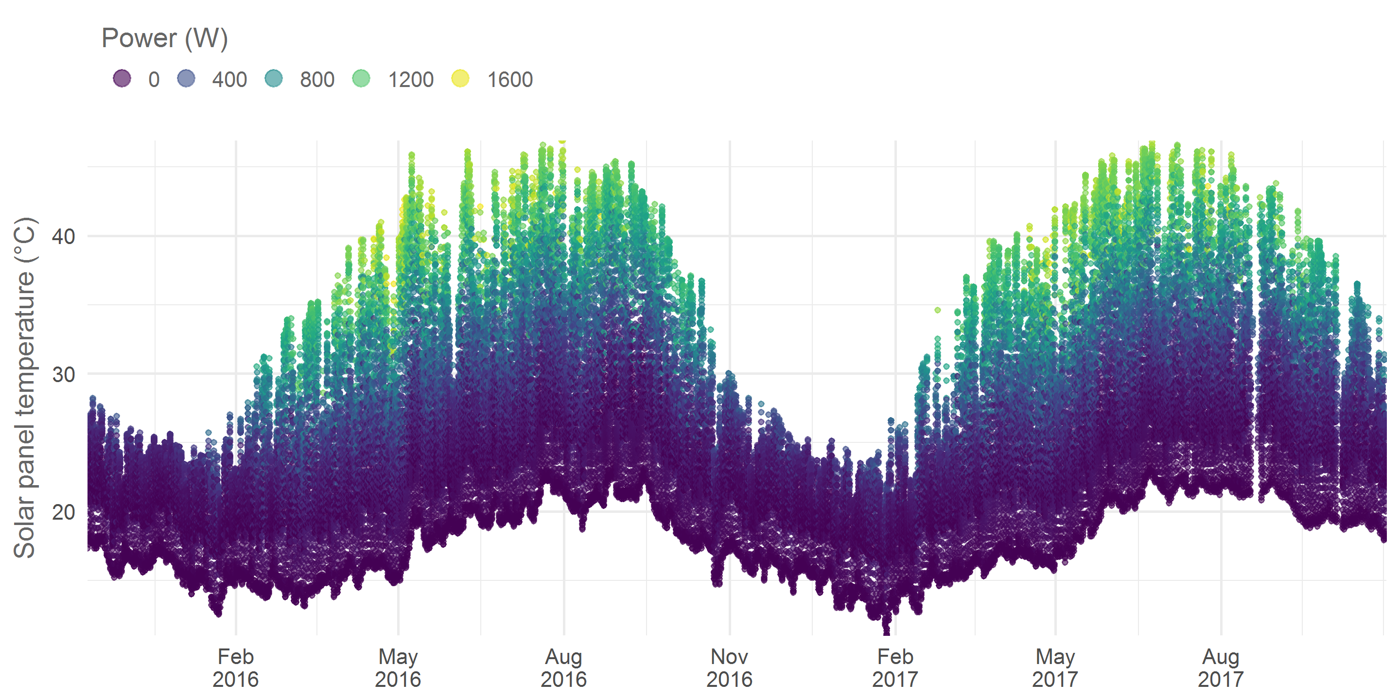 Again we see a nice seasonal pattern. 45°C is quite hot and will probably have a negative effect on the efficiency of the panels, in a follow up post I will investigate the effect of temperature on power yield in more detail.
Seasonal variance and the time of day
Let’s look at the effect of the time of day on the power level and color the data according to panel temperature.
solar_df%>%
mutate(hour = hour(timestamp) + minute(timestamp) / 60,
month = month(timestamp, label = T, abbr = F))%>%
select(month, hour, temperature, power)%>%
ggplot(aes(x = hour, y = power, colour = temperature)) +
geom_point(alpha = 0.8, size = rel(0.8)) +
facet_wrap(~month) +
scale_colour_gradientn(colors = temperature_palette,
name = 'Temperature (°C)',
breaks = c(15, 25, 35, 45)) +
labs(x = 'Hour of the day',
y = 'Power (W)') +
theme_minimal() +
theme(text = element_text(colour = "grey40"),
strip.text.x = element_text(colour = "grey40"),
legend.position = 'top',
legend.justification = 'left')+
guides(colour = guide_legend(title.position = "top", nrow = 1,
override.aes = list(size = rel(3))))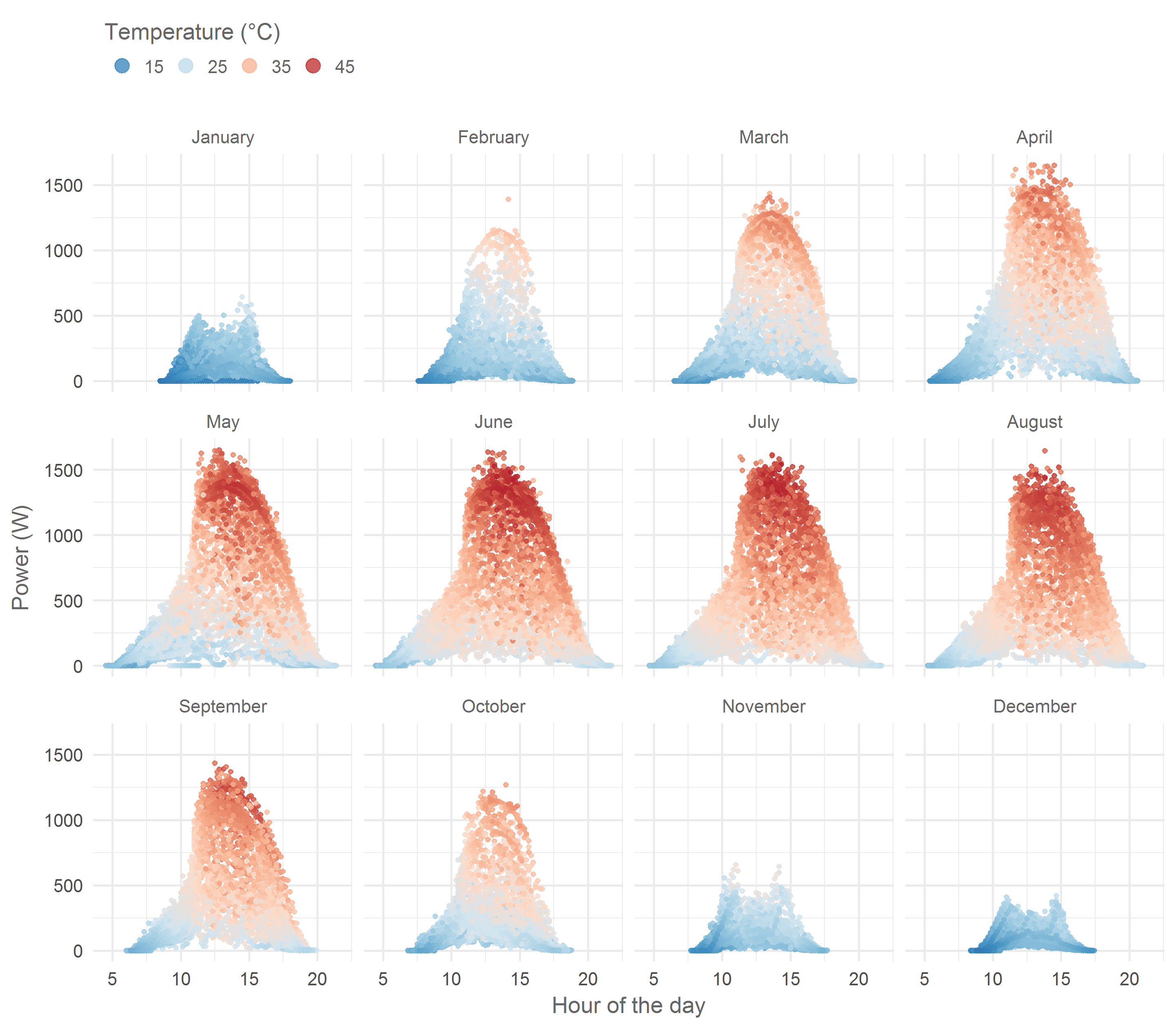 Notice how in February the panels remain cool while producing 500 Watts at noon whereas in summer panels are only cool in the early morning and late evening. Moreover, there are a couple of interesting things going on with the shape of these scatter plots. From November to January it seems like something bit the top off the typical bell shape. The culprit is a tree South of my house, in summer the Sun passes over this tree but in winter it is temporarily obscured, hence the lower power. A second tree more to the east but closer to my home causes the asymmetrical shape in summer months. In the mornings it too casts a shadow on the roof. In yet another follow up post I plan to investigate this in more detail.
Hourly aggregates
I want to create some visuals showing per hour aggregates over multiple years. To do so I must prep a new data set. I want to use vertical facets for the different years and have the time within each year on the x-axis. To have the same x-axis range for all years I will standardize all dates to a day in the year 1970. The actual year will be stored in a different column. Below is the analysis and the first 6 rows of the new data set.
per_hour_solar_df <- solar_df%>%
  mutate(hour = round(hour(timestamp) + minute(timestamp) / 60),
         date = as_date("1970-01-01") + yday(as_date(timestamp)) - 1,
         year = year(timestamp))%>%
  filter(year > 2015)%>%
  select(year, date, hour, temperature, power)%>%
  group_by(year, date, hour)%>%
  summarise(mean_temp = round(mean(temperature), 1),
            mean_power = round(mean(power)))%>%
  ungroup()

kable(head(per_hour_solar_df), align = 'c', format = 'html')| year | date | hour | mean_temp | mean_power |
|---|---|---|---|---|
| 2016 | 1970-01-01 | 9 | 16.0 | 2 |
| 2016 | 1970-01-01 | 10 | 18.8 | 80 |
| 2016 | 1970-01-01 | 11 | 22.5 | 265 |
| 2016 | 1970-01-01 | 12 | 24.1 | 235 |
| 2016 | 1970-01-01 | 13 | 24.0 | 206 |
| 2016 | 1970-01-01 | 14 | 23.4 | 155 |
Now let’s create a plot with the mean hourly temperature of the panels over multiple years.
per_hour_solar_df%>%
ggplot(aes(x = date, y = hour, fill = mean_temp))+
geom_tile()+
facet_grid(year~.)+
scale_y_continuous(expand = c(0, 0))+
scale_x_date(date_breaks = "2 months",
date_labels = "%B", expand = c(0, 0))+
scale_fill_gradientn(colors = temperature_palette,
name = 'Temperature (°C)',
breaks = c(15, 25, 35, 45)) +
labs(y = 'Hour of the day')+
theme_minimal()+
theme(text = element_text(colour = "grey40"),
axis.title.x = element_blank(),
strip.text.y = element_text(colour = "grey40",
size = rel(1.3)),
legend.position = 'top',
legend.justification = 'left',
panel.border = element_rect(colour = 'grey40',
fill = NA, size = rel(0.2)))+
guides(fill = guide_legend(title.position = "top", keywidth = 0.7,
keyheight = 0.7, label.vjust = 0.7))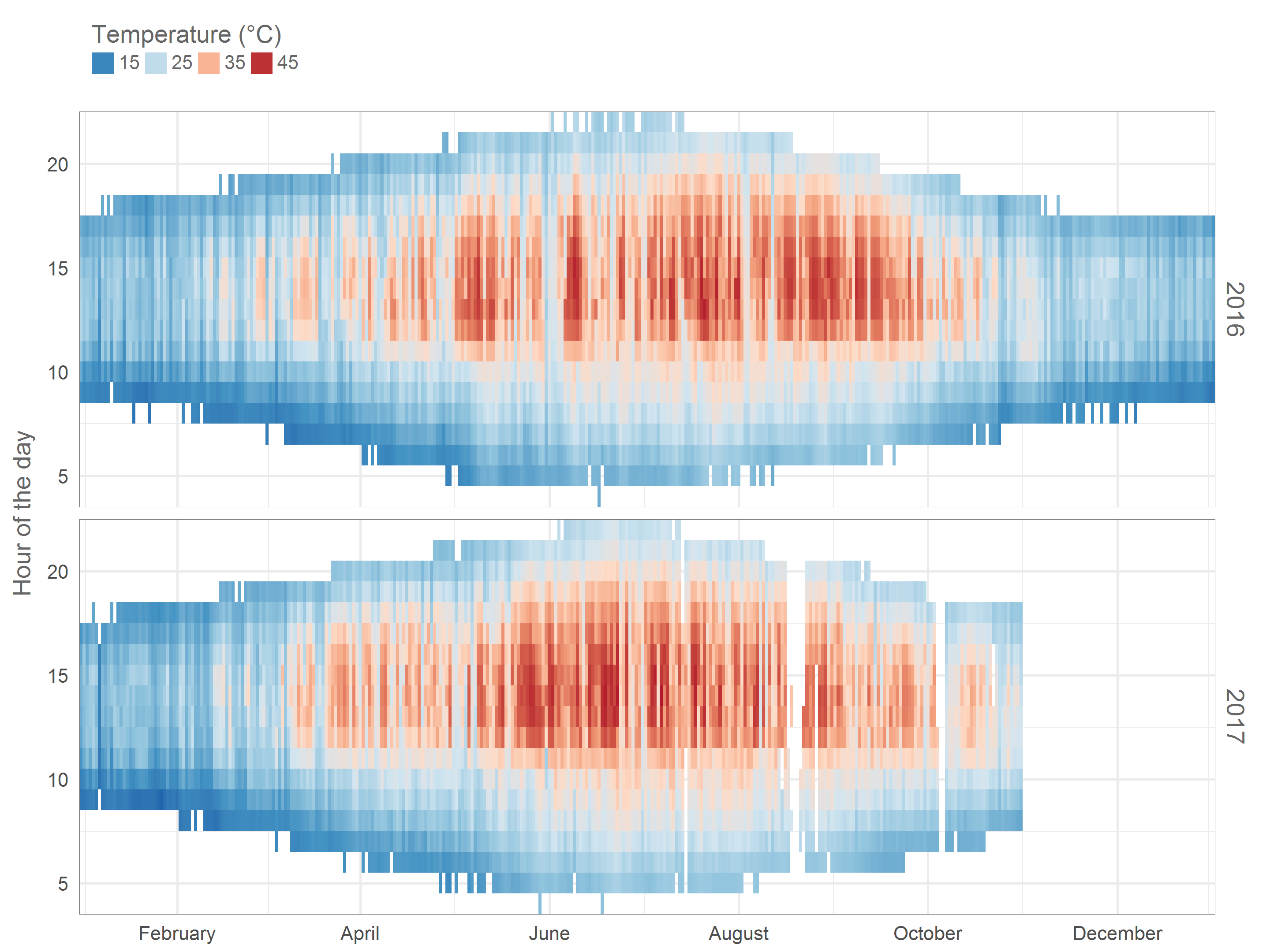 We can nicely see how daylengths evolve throughout the year. Temperatures above 35°C are caused by direct sunlight, notice how before 11AM this rarely happens due to the shade of the Eastern tree. You can also see that in the last couple of months I’ve had some issues with missing data.
This is all for now. I hope you enjoyed my first blog post. As mentioned I plan to dig a bit deeper in this data set in some follow up posts. Cheers!