They grow so fast (but how fast exactly?)
An analysis on our son's weight after birth and the overly strong pressure for breastfeeding.
Step 1, get a baby
When our first kid was born we decided to try breastfeeding him as long as possible since this is widely regarded as the healthiest thing to do. However, things didn’t go as smoothly as we hoped and the baby struggled to gain sufficient weight. In our urge to get some control over the situation, we started measuring the baby before and after every feeding session to check whether he actually drank something. Over time this resulted in a dataset that is much more detailed than a standard baby weight dataset with a measurement every few days or weeks.
After 2 months of breastfeeding this was the pattern:
library(tidyverse)
library(readr)
library(lubridate)
library(rprojroot)
rt <- rprojroot::is_rstudio_project

weight_df <- read_csv(rt$find_file("static/files/baby_weights.csv"))

# Derives bday from first weight entry
bday <- min(weight_df$datetime)

# Reading and pre-processing the WHO data
who_url <- "https://www.who.int/childgrowth/standards/wfa_boys_p_exp.txt"
who_df <- read_delim(who_url, delim = "\t")%>%
  setNames(tolower(make.names(names(.))))%>%
  mutate(datetime = bday + days(age))%>%
  select(datetime, p5, p25, p50, p75, p95) %>%
  gather(key = quantile, value = weight, p5:p95)

# create theme to use in ggplots
custom_theme <- theme_bw()+
  theme(legend.title = element_blank(),
        legend.justification = 'top',
        panel.border = element_blank(),
        panel.grid.major = element_line(color = 'grey50',
                                        size = rel(0.6)),
        axis.title.x = element_blank(),
        axis.ticks = element_line(color = 'grey50',
                                  size = rel(0.6)))

weight_df%>%
  filter(datetime < bday + days(53)) %>%
  ggplot(aes(datetime, weight))+
  geom_line(data = who_df%>%
                    filter(datetime < bday + days(55)),
            aes(group = quantile))+
  geom_label(data = who_df%>%
              filter(datetime < bday + days(55))%>%
              group_by(quantile)%>%
              filter(datetime == max(datetime)),
            aes(group = quantile, label = quantile),
            hjust = 0.1)+
  geom_point(aes(color = feeding_status), alpha=0.5, shape=20)+
  scale_color_brewer(palette = 'Set2', na.value = "grey50")+
  scale_x_datetime(limits = c(bday - hours(17),
                              bday + days(57)),
                 date_breaks = "2 weeks",
                 date_labels = "%B %d")+
  labs(title = "Baby weight over time",
       y = 'Weight (Kg)')+
  custom_theme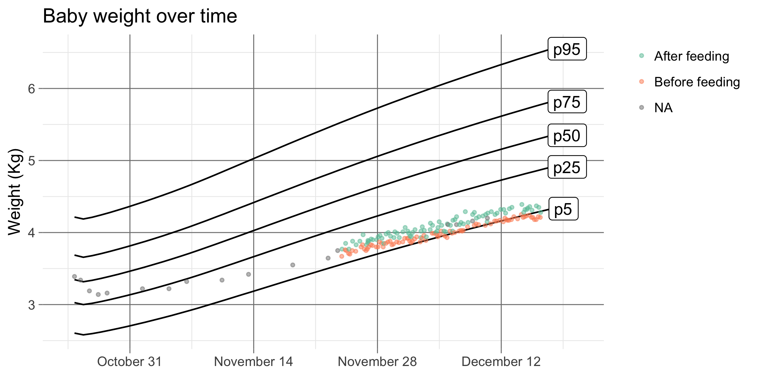
The black lines are the baby weight quantiles provided by the World Health Organization. Our son was right at the median (p50) at birth but gradually lost ground and was dropping below the 5% quantile after 2 months. After struggling for one month we rented a scale to measure him before and after feeding sessions, you can see these measurements as colored dots in the plot.
Taking matters in our own hands
Up to this point, we’d been following the advice given to us by a nurse/midwife who was following up on us. She’s a strong breastfeeding advocate and as first-time parents we kept following her advice to push through during those first two months. However, as time progressed our son kept losing ground on the growth curve and the advice to just keep trying felt more and more out of touch with the reality that it simply wasn’t working. We, therefore, decided to take matters in our own hands and ignore the pressure to stick to breastfeeding.
weight_df %>%
  filter(datetime < bday + days(115)) %>%
  ggplot(aes(datetime, weight))+
  geom_line(data = filter(who_df, datetime < bday + days(115)),
            aes(group = quantile))+
  geom_label(data = who_df%>%
              filter(datetime < bday + days(115))%>%
              group_by(quantile)%>%
              filter(datetime == max(datetime)),
            aes(group = quantile, label = quantile),
            hjust = 0.1)+
  geom_point(aes(color = feeding_status), alpha=0.5, shape=20)+
  annotate("segment", x = bday + days(71),
           xend = bday + days(58),
           y = 3.6, yend = 4.2, color = "grey10",
           size=1.2, alpha=0.9, arrow=arrow())+
  annotate("text", x = bday + days(93),
           y = 3.4, label = "Switch to bottle feeding" ,
           size=4.5, fontface="bold")+
  scale_color_brewer(palette = 'Set2', na.value = "grey50")+
  scale_x_datetime(limits = c(bday - hours(17),
                              bday + days(117)),
                 date_breaks = "1 month",
                 date_labels = "%B")+
  labs(title = "Baby weight over time",
       y = 'Weight (Kg)')+
  custom_theme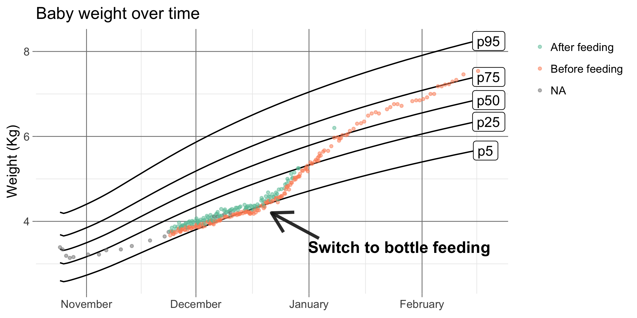
The results were spectacular, in just one month time the baby raced back past the 50% quantile and kept going. We went from having a skinny baby to a rather chubby one in no time. Fast forward two and a half years and the baby is now a happy toddler doing just fine.
Conclusion
I wouldn’t want the takeaway from this post to be that breastfeeding is bad, it clearly isn’t and I too believe mother’s milk is healthiest. I would, however, like people who advise young parents on this matter to be less dogmatic about the whole thing. Due to the pressure we felt from different sources it seemed that moving towards bottle feeding was irresponsible while in hindsight the opposite was true and we stuck to it for too long.
Additional number crunching
Since this dataset has a pretty high level of detail there are some additional things that we can learn here. One of those is the within-day variance in baby weights. To derive this variance we’ll plot a simple linear model on a part of the data where the weight increased at a steady pace.
# Filter on a part fhe data with a linear increase
linear_df <- weight_df %>%
  filter(datetime > bday + days(29)) %>%
  filter(datetime < bday + days(51))

# Simple linear model
model <- lm(data = linear_df, weight~datetime)

library(broom)
linear_df %>%
  ggplot(aes(x = datetime))+
  geom_point(aes(y = weight, color = feeding_status))+
  # Use the model predictions to draw the black line
  geom_line(data = augment(model), aes(y = .fitted))+
  scale_color_brewer(palette = 'Set2', na.value = "grey50")+
  labs(title = "Baby weight over time with linear model predictions",
       y = 'Weight (Kg)')+
  custom_theme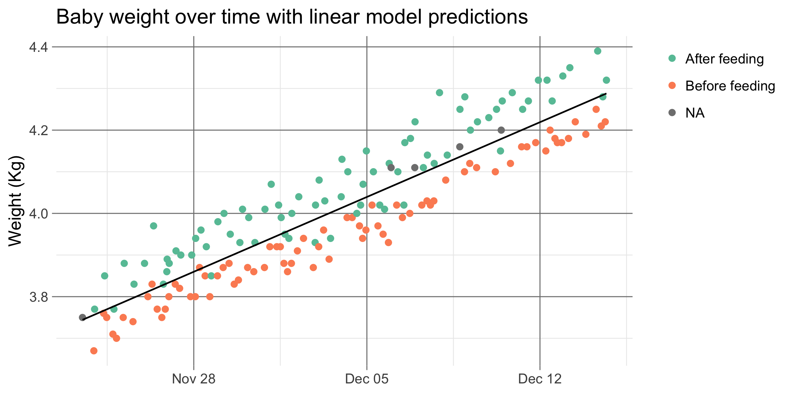
You can see that, while the overall trend is a linear increase, the within-day variance is quite big. There are days where the baby is 100 grams below the linear trendline at one point and 100 grams above it at another.
Let’s plot the residuals to get a better idea of the spread.
augment(model) %>%
  ggplot(aes(x=.resid))+
  geom_histogram(bins = 50, aes(fill=linear_df$feeding_status),
                 color='grey40', size=rel(0.2))+
  scale_fill_brewer(palette = 'Set2', na.value = "grey50")+
  labs(title = "Histogram of how much actual baby weights differ from the linear increase",
       x = 'Weight model residual (Kg)',
       y = 'Count')+
  custom_theme + theme(legend.key.width = unit(0.32, "cm"))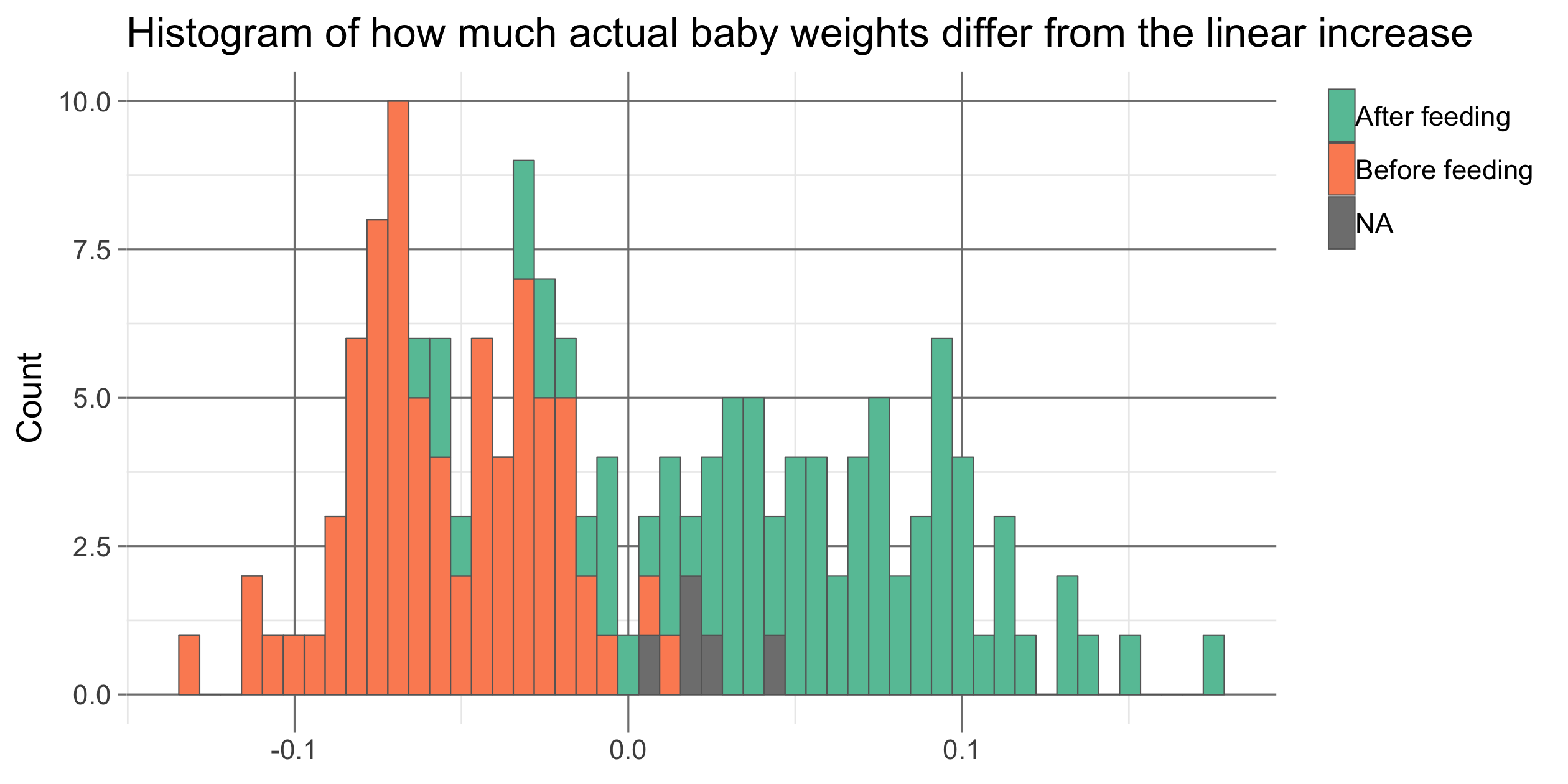
Since the spread in baby weights is quite big it is hard to tell how much weight a baby has gained over a couple of days time if you only measure the baby once on both days. This was something that bugged me when the nurse would tell us the baby was doing fine after a measured increase of 100 grams over two days somewhere at the beginning of November.
One side note on the data shown here is that it kind of exaggerates the spread in daily values since we always measured the baby before and after feedings when the differences were most extreme. Because of this, the distribution takes a bimodal shape with measurements before feedings on the left and after feedings on the right. If you’d measure at random points during the day you’d get a normal distribution.